No post yesterday, I spent the evening plugging away at the next section of our business plan that is due tomorrow.
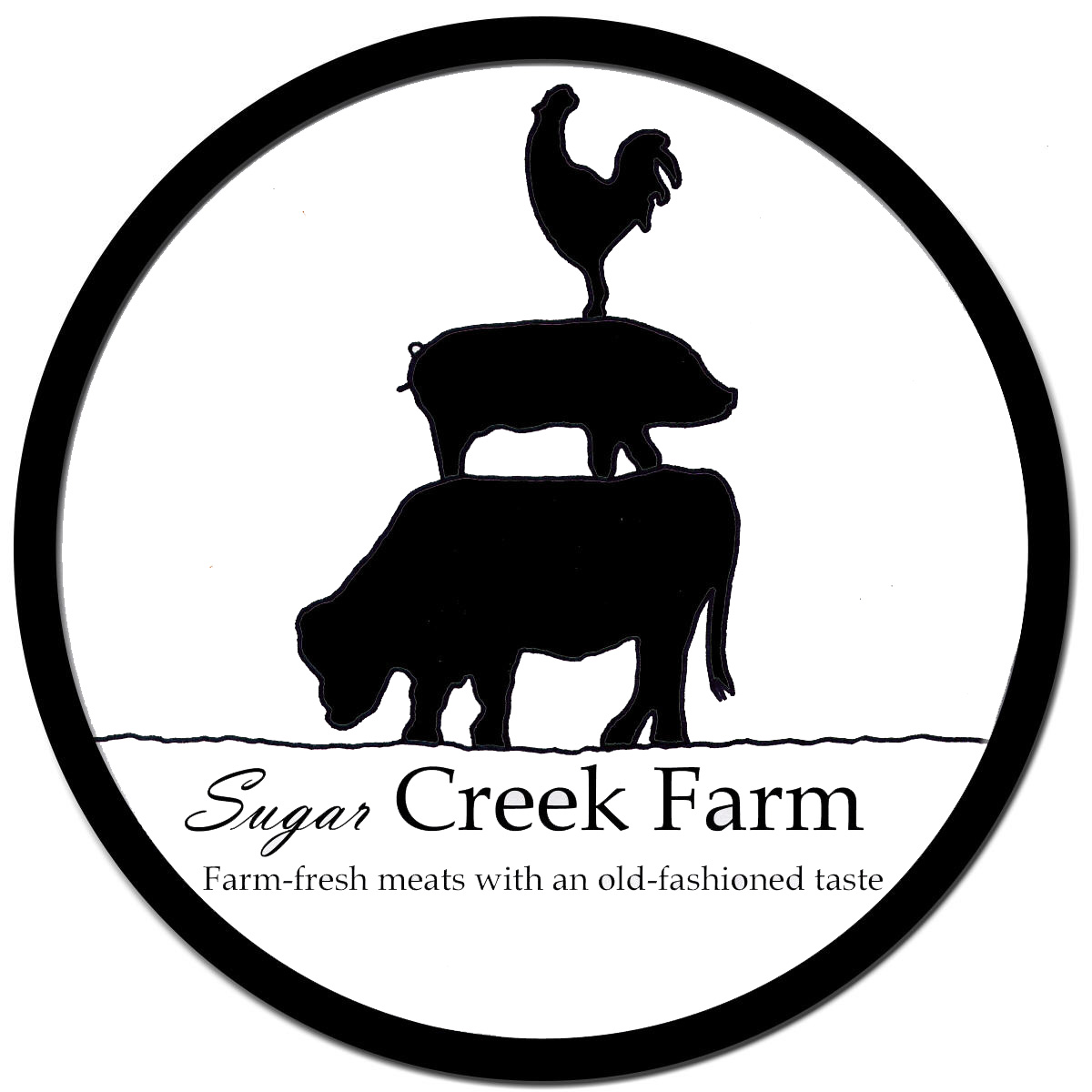
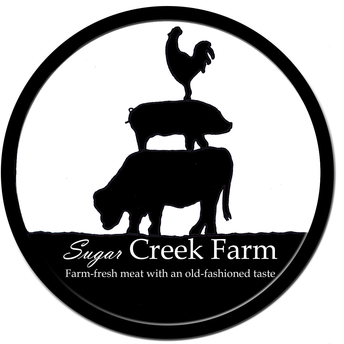
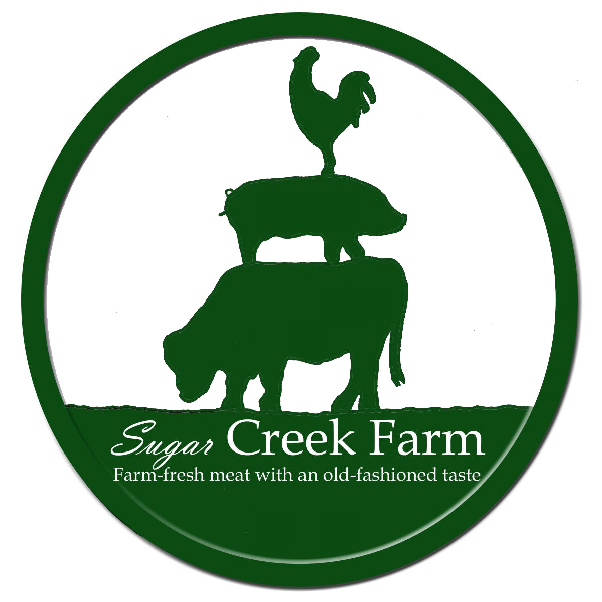
I also played around with an idea for a new farm logo. Our old logo just had a cow on it and I wanted to include our expansion into pork and poultry. What do you think?
Edited: I had to make an adjustment to the logo because my husband and his coworkers have vulgar little minds.
I’ve also been tossing around website address ideas. I want something easy to remember and to spell. Some of these I think are too long, maybe three words is the limit. What do you think?
www.oursugarcreekfarm.com
www.thefarmonsugarcreek.com
www.sugarcreekpastures.com
www.sugarcreekhomestead.com
www.sugarcreekhome.com
www.sugarcreekfarmhome.com
We got hit with a nasty storm last night so the kids get a snow day today. Hopefully the weather cooperates so I can make it to class tomorrow
I really like the logo – I think the fonts on the first, as well as the simpel color contrast, make it easier to read. Since your main market seems to be the meats, maybe sugarcreekmeats as the web address… 🙂 Shannon
Thanks for the suggestion Shannon! I’d thought of that one, too, but it makes me think of butchers instead of farmers. I don’t know, this is making me more nuts than it should.BTW, loved the baby belly pic!
I like the top one the best without the solid bottom. It looks like it will size down small without the words for icons, etc. It is distinctive!Do you think you may do veggies? I might play around with the circle beign the outline of a pumpkin, strawberry or something else. Then again, it may be too busy, you won’t know until you try.Down here in the central Iowa tropics we have 50 degrees and only the threat of t-storms. Enjoy the last snow!
I like the top one the best without the solid bottom. It looks like it will size down small without the words for icons, etc. It is distinctive!Do you think you may do veggies? I might play around with the circle being the outline of a pumpkin, strawberry or something else. Then again, it may be too busy, you won’t know until you try.Down here in the central Iowa tropics we have 50 degrees and only the threat of t-storms. Enjoy the last snow!
i like the second logo the best. 🙂 my fave web name is http://www.thefarmonsugarcreek.com. looks like things are moving!
I love the middle one. I can imagine what your hubby was thinking though! :)I take it you can’t get sugarcreekfarm.com. How about sugarcreekfarm.net? Too confusing?
I like the second one best. They look really cool.
I like the second one best. They look really cool.
I love the logo! Great work! Any are awesome…:)I like “oursugarcreekfarm”…don’t have any good reasons, just an emotional attachment to it. 😉 “Sugarcreekpastures” is cute, too. (And I mean cute in a good way.)Anyway…I don’t have the credentials to be making suggestions…so ignore me! 🙂